


Futura with photography
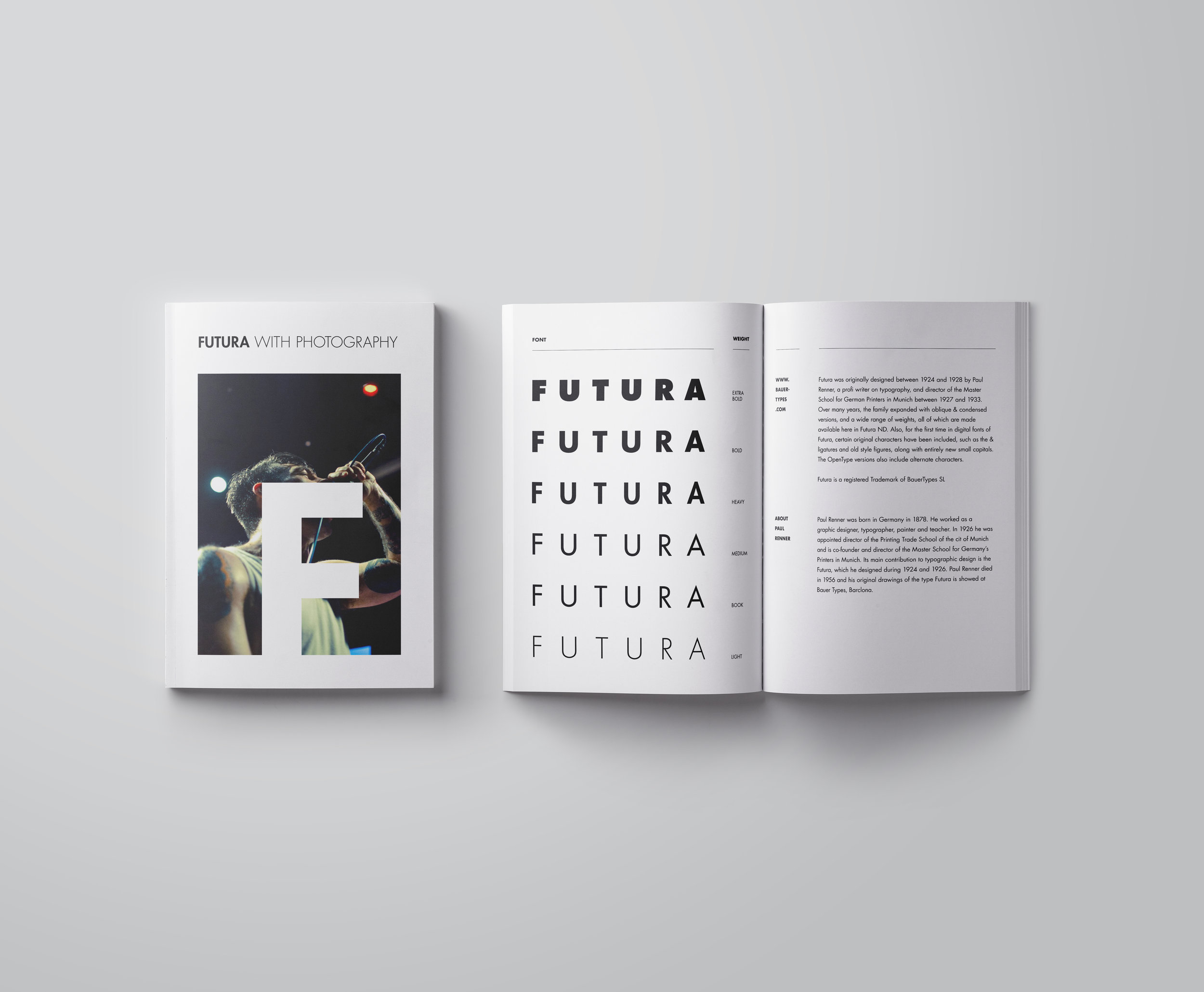
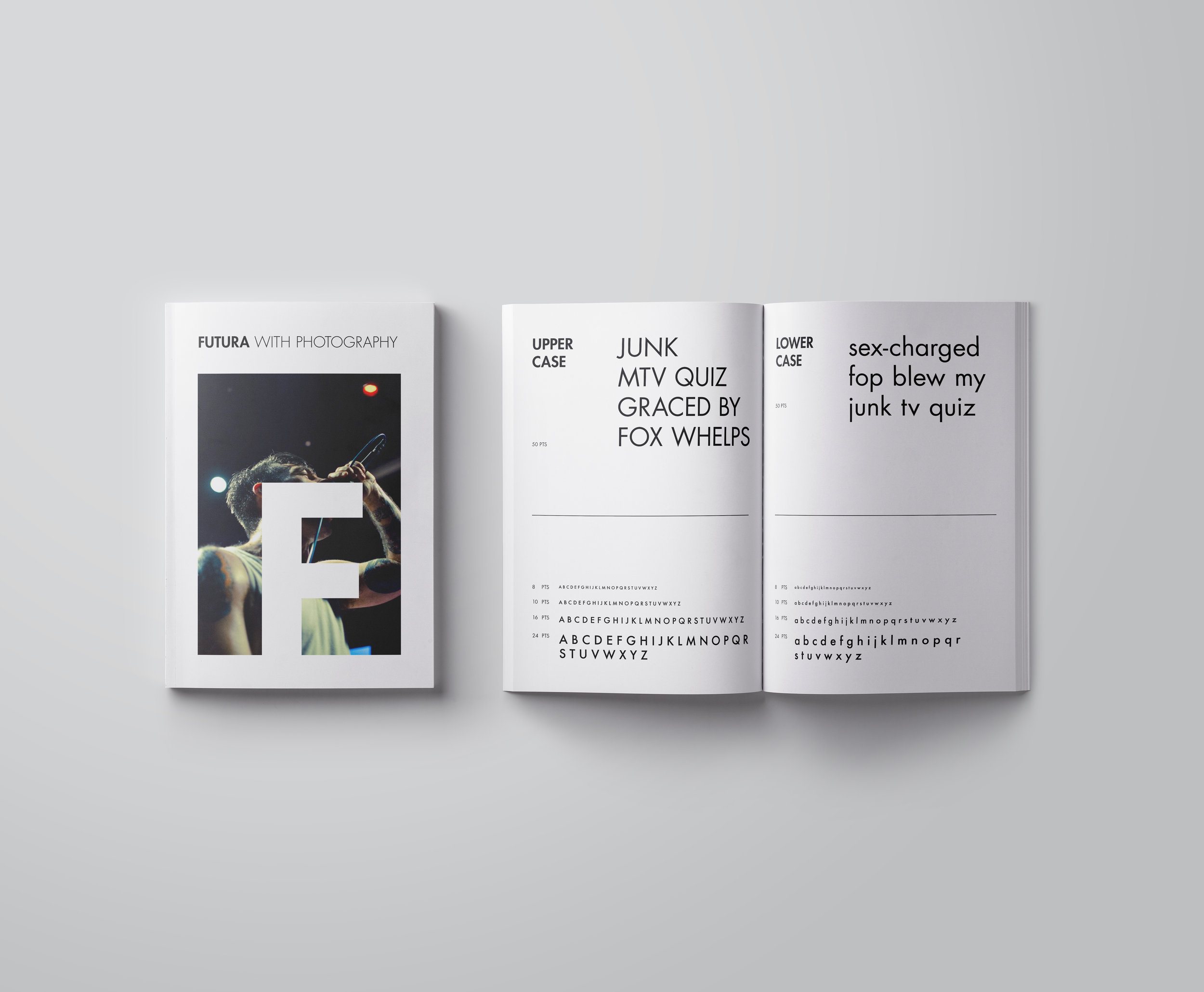
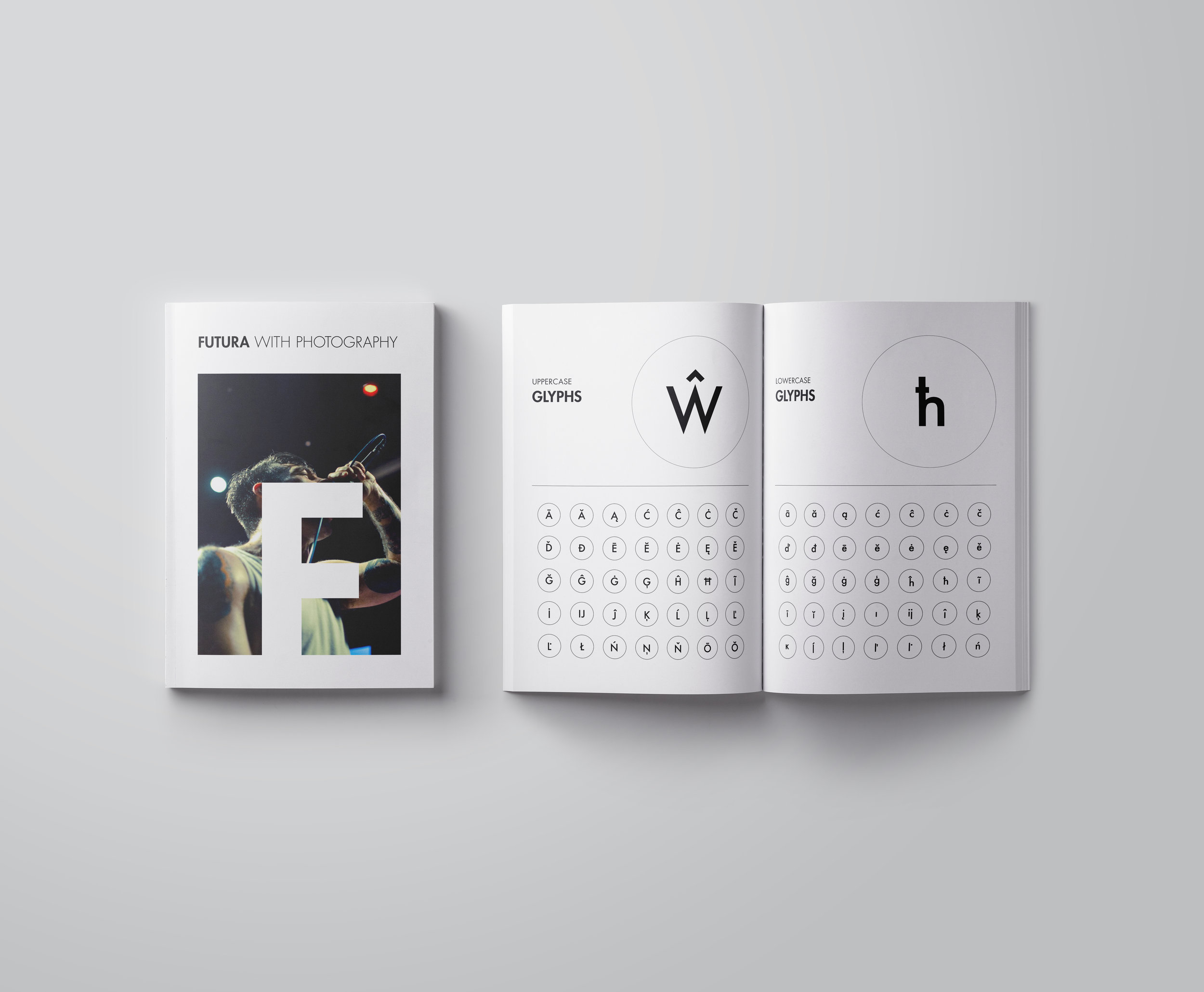
Futura Type specimen
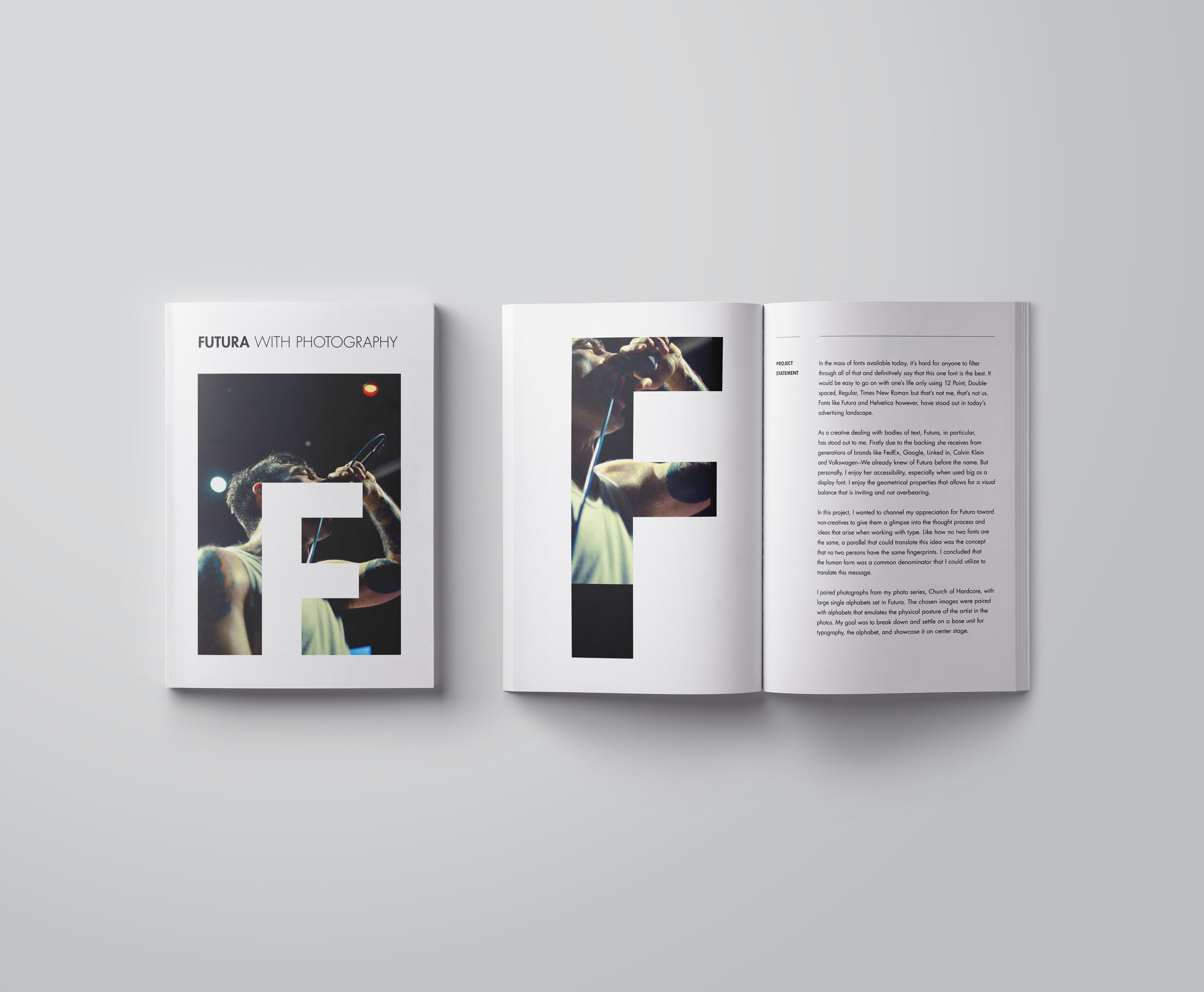
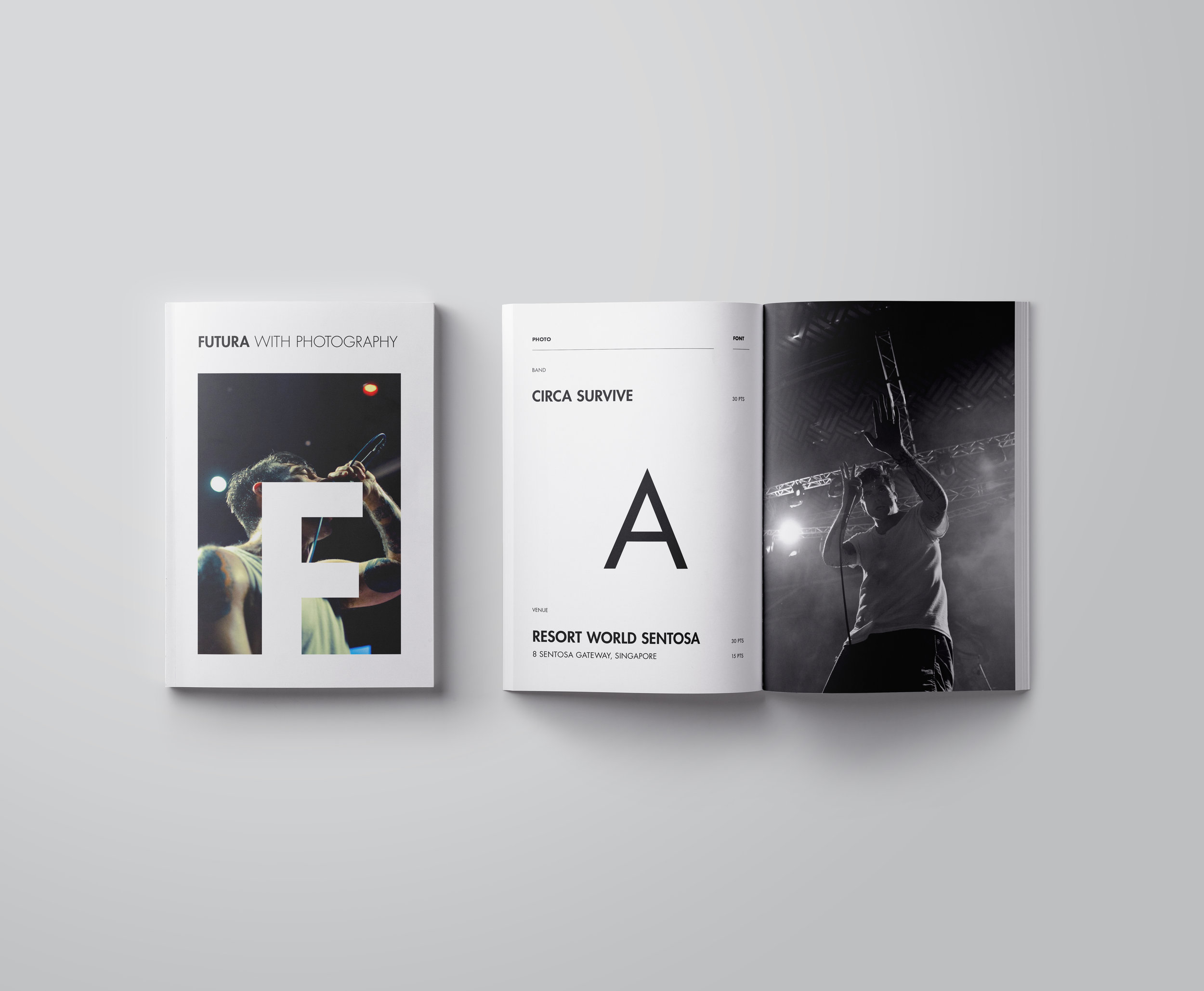
In this project, I wanted to channel my appreciation for Futura toward non-creatives. Like how no two fonts are the same, I use the analogy that no two persons have the same fingerprints and concluded that the human form was a common denominator that I could utilize to translate this message.
I paired photographs from my series, Church of Hardcore, that documents the independent underground hardcore scene in Singapore, with large single characters set in Futura. The chosen images were paired with alphabets that mirrors the physical posture of the musician in the photos. My goal was to establish a base unit for typography, the alphabet, and showcase it on center stage.
Futura w Photography was designed as a multi-page type specimen. New York City. Fall 2016.